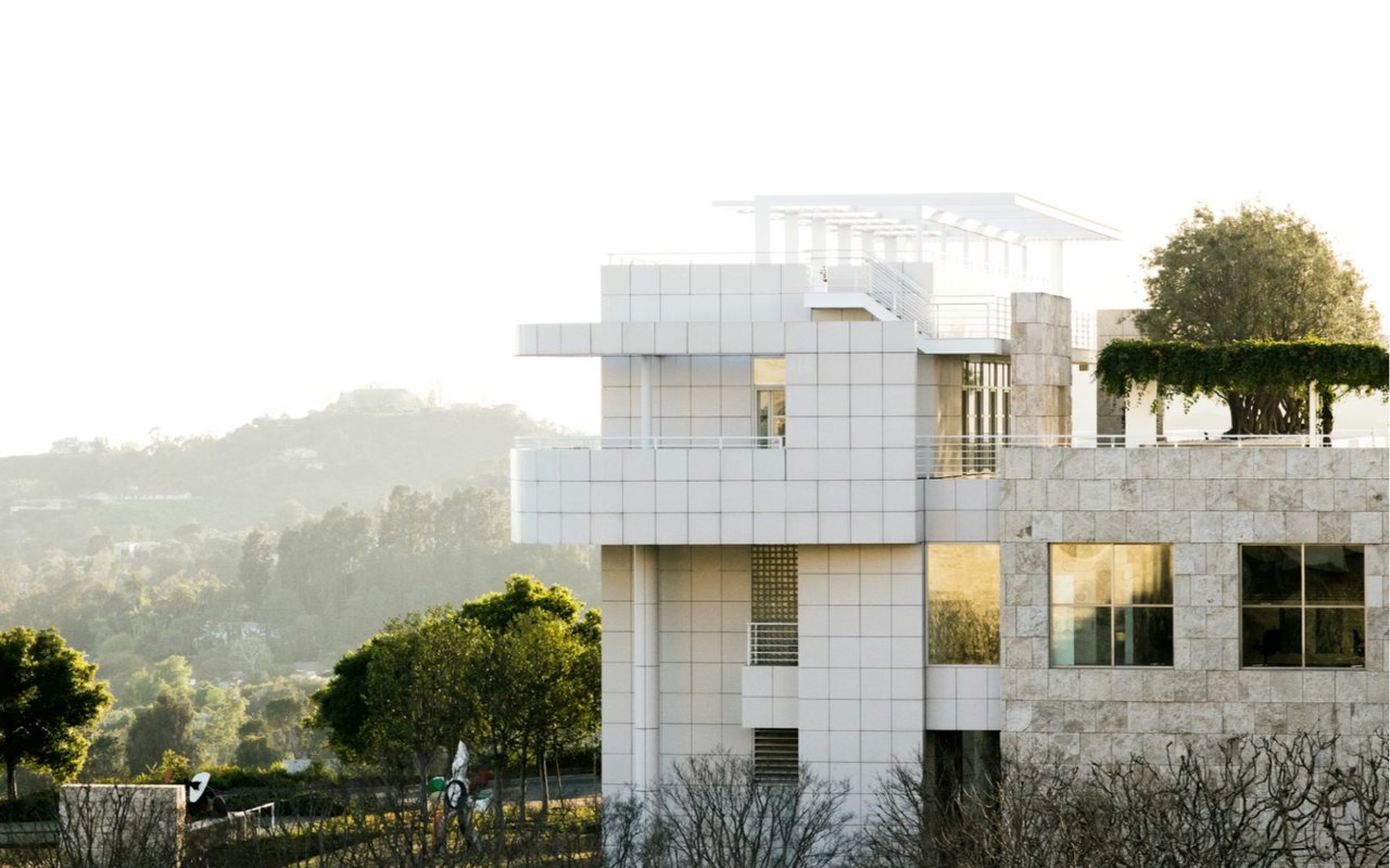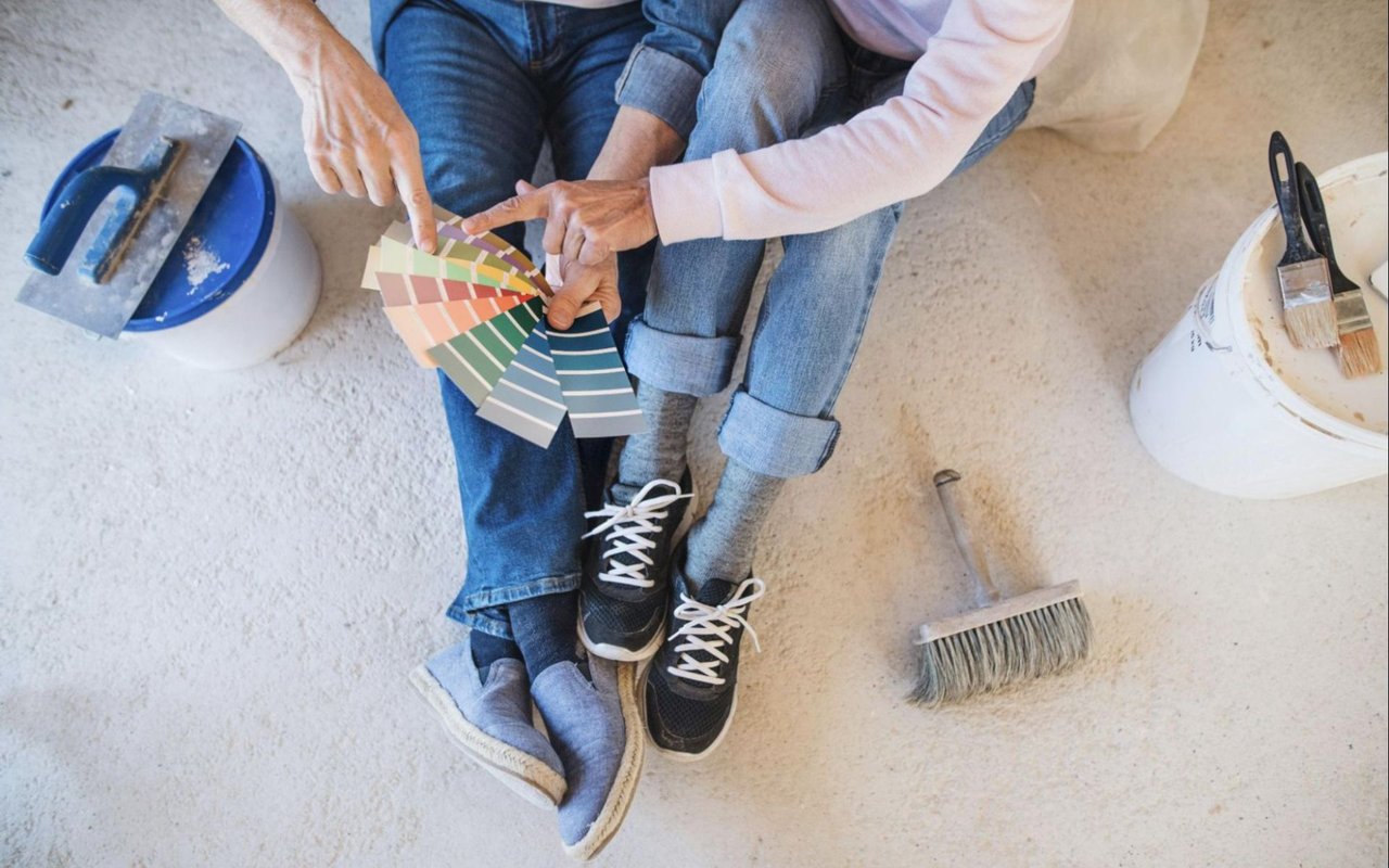
Choosing the right paint colors for your Pasadena home is more than a mere design choice. It’s a powerful way to influence how each room feels, how natural light is reflected, and even how spacious or close-knit a space appears. With the region’s distinctive mix of historic and modern architecture, ranging from Craftsman bungalows to sleek hillside estates, Pasadena provides the perfect canvas for exploring the science of color.
While many homeowners rely on instinct when selecting paint, there’s a deeper layer of psychology and design theory at play. Color influences emotion, perception, and behavior, making it one of the most critical design decisions in any living space. Whether you're planning a full remodel or simply refreshing a few walls, learning how to harness the power of color will help you create a home that’s both visually stunning and personally fulfilling.
Understand Color Psychology Before You Paint
Color psychology plays a central role in how your home feels on a day-to-day basis. For example, blues and greens often evoke feelings of calm and balance, making them popular choices for bedrooms and bathrooms. These tones can help you unwind at the end of the day, especially in a quiet space like a primary suite that overlooks a garden or outdoor retreat. Meanwhile, warmer hues like soft yellows, blush tones, and gentle corals create warmth and optimism, making them ideal for kitchens or sun-drenched sitting areas.
If you want to create an energizing space, consider using bolder colors in areas like a home office, workout room, or game room. Rich jewel tones — such as emerald green or navy blue — can add a sense of sophistication and energy when used thoughtfully. You don’t need to coat an entire room in these shades. Even an accent wall or painted built-in shelving can elevate a space with depth and dimension. The key is to match the emotional tone of a color to the purpose of the room.
If you want to create an energizing space, consider using bolder colors in areas like a home office, workout room, or game room. Rich jewel tones — such as emerald green or navy blue — can add a sense of sophistication and energy when used thoughtfully. You don’t need to coat an entire room in these shades. Even an accent wall or painted built-in shelving can elevate a space with depth and dimension. The key is to match the emotional tone of a color to the purpose of the room.
Let Pasadena’s Natural Light Guide You
Pasadena enjoys abundant sunlight for most of the year, which makes natural light a huge factor when selecting interior paint. South-facing rooms receive warm, steady sunlight throughout the day, which tends to bring out the warmth in your paint selections. In those spaces, cooler tones like soft grays, pale blues, or dusty greens can help balance the room’s brightness. On the other hand, north-facing rooms can appear dimmer and cooler, so warmer tones like creamy ivory, warm taupe, or peach-infused neutrals can make the space feel more inviting.
Keep in mind that the quality of light changes throughout the day. What looks like a subtle beige in the morning may appear pink or even gray by evening. Before committing to a color, paint swatches on several walls in your home and observe how they evolve from morning to night. The same shade will look entirely different in a sun-filled living room than in a shaded hallway or corner reading nook. Giving yourself a few days to assess the paint in various lighting conditions will help you make a confident, informed decision.
Keep in mind that the quality of light changes throughout the day. What looks like a subtle beige in the morning may appear pink or even gray by evening. Before committing to a color, paint swatches on several walls in your home and observe how they evolve from morning to night. The same shade will look entirely different in a sun-filled living room than in a shaded hallway or corner reading nook. Giving yourself a few days to assess the paint in various lighting conditions will help you make a confident, informed decision.
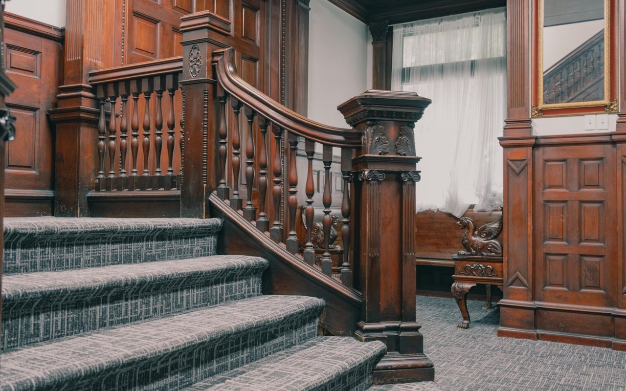
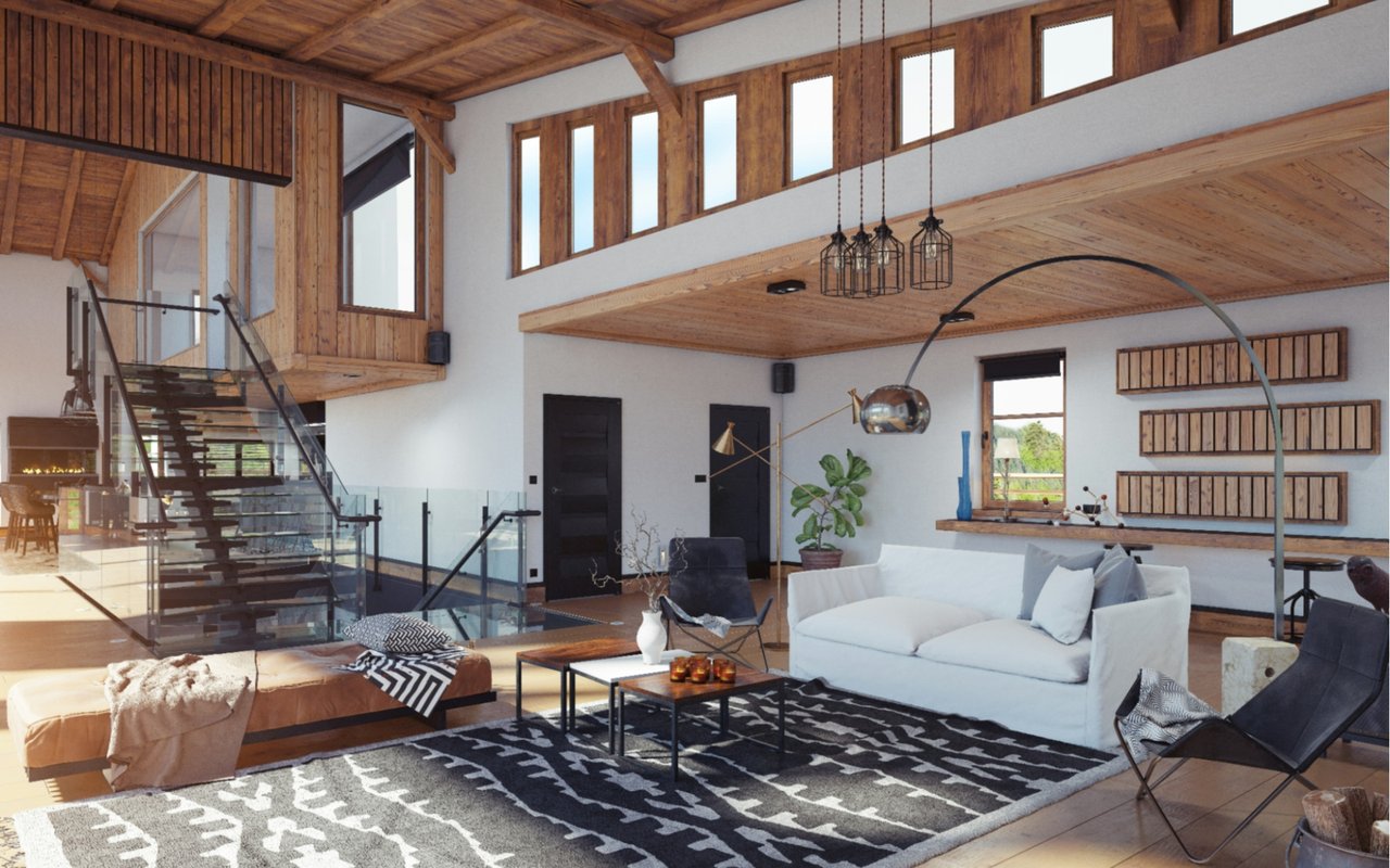
Complement Your Home’s Architecture and Era
Pasadena is known for its character-rich homes, many of which feature distinct architectural details. When choosing paint tones, it’s essential to consider the era and style of your property. For example, a restored 1920s Spanish Revival home may shine with earthy, natural colors — like terracotta, olive, and ivory — that reflect the original design aesthetic. Meanwhile, a contemporary hillside home with expansive windows may benefit from crisp whites, steely blues, or sleek charcoals that emphasize clean lines and open spaces.
Craftsman-style homes often pair beautifully with rich, muted colors, such as sage green, clay red, and slate gray. These colors highlight wood trim, built-in cabinetry, and exposed beams while preserving the home’s vintage charm.
If your home has a more transitional feel, a combination of warm and cool neutrals can create harmony between traditional and modern elements. Let your home’s architectural features guide your choices so your color palette enhances — not competes with — the structure’s identity.
Use Neutrals as a Foundation
Neutrals are often overlooked as “safe” or “boring,” but when chosen carefully, they provide the foundation for a sophisticated, cohesive design. Soft white, greige, mushroom, and taupe offer incredible versatility and adaptability. They create a calming background for bolder design choices while offering enough personality to stand on their own. In homes with open floor plans, neutral tones allow one space to flow seamlessly into the next without feeling disconnected.
One of the most significant benefits of using neutrals is their ability to reflect light and enhance architectural features. A warm neutral can accentuate crown molding or textured walls, while a cooler neutral can sharpen the contrast around modern metal accents or sleek cabinetry. If you’re staging your Pasadena home to sell, neutrals are particularly effective at creating a fresh, clean slate that appeals to a range of potential buyers. Of course, you can still add color through accessories like rugs, throw pillows, and art, which are easy to switch out over time.
One of the most significant benefits of using neutrals is their ability to reflect light and enhance architectural features. A warm neutral can accentuate crown molding or textured walls, while a cooler neutral can sharpen the contrast around modern metal accents or sleek cabinetry. If you’re staging your Pasadena home to sell, neutrals are particularly effective at creating a fresh, clean slate that appeals to a range of potential buyers. Of course, you can still add color through accessories like rugs, throw pillows, and art, which are easy to switch out over time.
Think About Paint Finish, Not Just Color
The finish of your paint affects both appearance and performance. Matte and flat finishes offer a velvety look and are ideal for low-traffic areas like bedrooms or formal living rooms. These finishes tend to absorb light rather than reflect it, which helps soften bold colors or conceal imperfections on walls. However, they’re not always the most practical for spaces that require frequent cleaning or wipe-downs.
Eggshell and satin finishes strike a balance between style and function. They reflect just enough light to add a subtle sheen, which enhances color richness without becoming glossy. These finishes are great for hallways, dining rooms, and home offices. For kitchens, bathrooms, and children’s spaces, consider semi-gloss or gloss finishes, which are durable and easy to clean. Keep in mind that higher gloss levels will showcase wall texture and any flaws in the surface, so proper prep is key.
Eggshell and satin finishes strike a balance between style and function. They reflect just enough light to add a subtle sheen, which enhances color richness without becoming glossy. These finishes are great for hallways, dining rooms, and home offices. For kitchens, bathrooms, and children’s spaces, consider semi-gloss or gloss finishes, which are durable and easy to clean. Keep in mind that higher gloss levels will showcase wall texture and any flaws in the surface, so proper prep is key.
Balance Bold Colors With Intentional Design
If you're drawn to bold colors, there’s no reason to avoid them, but it’s important to use them with intention. Deep teal, burnt orange, charcoal, and even moody plum can all work beautifully in the right context.
The trick is to balance these rich tones with softer accents and textures to avoid overwhelming the room. You can also introduce bold color through paint in less expected areas, such as a powder room ceiling, a stairwell wall, or the back of a bookcase.
In historic homes, bold paint colors can serve as a modern contrast that brings a fresh edge to timeless interiors. In newer builds, they add drama and personality. To keep the look elevated, layer the bold color with complementary elements — like natural wood, brass fixtures, or textured textiles — that bring warmth and dimension. Bold doesn’t have to mean loud. With the right styling, it can feel curated and refined.
Bring Your Pasadena Home to Life
Choosing paint colors for your Pasadena home is both an art and a science. It’s a chance to express your personality, honor your home’s architecture, and create a welcoming environment tailored to your lifestyle.
Whether you're planning to live in your home for years or preparing it for the market, color is a powerful tool that can refresh, energize, and transform. If you’re prepared to sell or find the perfect match, The Sabatella Delair Group will help you achieve success in Pasadena real estate. Reach out today.
Whether you're planning to live in your home for years or preparing it for the market, color is a powerful tool that can refresh, energize, and transform. If you’re prepared to sell or find the perfect match, The Sabatella Delair Group will help you achieve success in Pasadena real estate. Reach out today.